转载文章,来源于:(original post:)http://webdesign.tutsplus.com/articles/quick-tip-easy-css3-checkboxes-and-radio-buttons–webdesign-8953
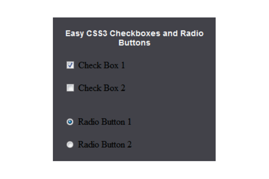
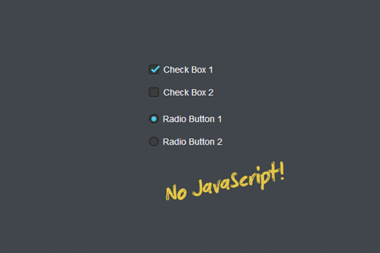
Ever wondered how to style checkboxes and radio buttons, but without JavaScript? Thanks to CSS3 you can!
Step 1: Understanding the Process
Recommended Reading: The 30 CSS Selectors you Must Memorize
For those of you that feel confident in your CSS abilities already and just want a nudge in the right direction, here is the most important line of CSS in the entire tutorial:
1 2 3 | input[type="checkbox"]:checked + label { } |
Now, for those of you who feel you may need more direction, fear not,read onward!
Alright, so back on topic now. What exactly will we be doing? Well, due to CSS3’s nifty little :checked pseudo selector, we’re able to target an element based on its checked (or unchecked) status. We can then use the “+” adjacent sibling selector from CSS2.1 to target the element directly following the checkbox or radio, which in our case is the label.
Step 2: Setting up our HTML
Now, we start off by creating our HTML and CSS files (or however you prefer handling your styles) and get to work. I’ll assume you know how to do that, so we won’t have to get into it.
For the purpose of getting you on your way, I will only demonstrate this technique on a checkbox, but the process for radio buttons is identical, and is included in the source.
Okay, let’s actually begin then, shall we? We start by creating our checkbox input, followed by a label.
1 2 | <input type="checkbox"> <label>Styled Check Box</label> |
Now, just in case you don’t know much about the <label> element, you must connect the input and the label in order for you to interact with the input through the label. This is done by using, for="" and the input’s ID.
1 2 | <input id="c1" type="checkbox" name="cc"> <label for="c1">Check Box 1</label> |
I also will add a <span> inside of the label, which is more personal preference than anything else, but all will become clear in step 3.
Step 3: What We’re Here For: CSS
This is where the fun begins. First thing we do, which is the basis for this whole tutorial, is hide the actual checkbox.
1 2 3 | input[type="checkbox"] { display:none; } |
Now that that’s done, we can style the label, but more specifically the span inside of the label. I do it this way in order to give myself more control over the exact position of the check box. Without it you would probably be using a background image in the label directly, and positioning it may become difficult.
1 2 3 4 5 6 7 8 9 | input[type="checkbox"] { display:none; } input[type="checkbox"] + label span { display:inline-block; width:19px; height:19px; background:url(check_radio_sheet.png) left top no-repeat; } |
Alright, let me explain this quickly. First off, notice the background. I have a small sprite sheet for these, so all I have to do is set the background position on this span. The span itself is the exact width and height of each “sprite” in the sheet, making it easy to define each state.
Here is the rest of the CSS, specific to my styling. This is purely for aesthetics and specific to either my taste or this design.
1 2 3 4 5 6 7 8 9 10 11 12 | input[type="checkbox"] { display:none; } input[type="checkbox"] + label span { display:inline-block; width:19px; height:19px; margin:-1px 4px 0 0; vertical-align:middle; background:url(check_radio_sheet.png) left top no-repeat; cursor:pointer; } |
Step 4: Making it Work
There’s not too much work left, so let’s get this wrapped up. The last thing you will need to do is provide a state for the element when the input is checked, and optionally also for on hover. This is quite simple, just take a look!
1 2 3 4 5 6 7 8 9 10 11 12 13 14 15 | input[type="checkbox"] { display:none; } input[type="checkbox"] + label span { display:inline-block; width:19px; height:19px; margin:-1px 4px 0 0; vertical-align:middle; background:url(check_radio_sheet.png) left top no-repeat; cursor:pointer; } input[type="checkbox"]:checked + label span { background:url(check_radio_sheet.png) -19px top no-repeat; } |
Notice that because I used a sprite sheet, all I have to do is change the background position. Notice, also, that all I had to do to style the label’s span for when you “check” a checkbox/radio button, was use the CSS3 :checked pseudo selector.
Quick Note on Browser Support
Pseudo selectors have great support across all browsers, but IE spoils the party. You can pretty much forget about :checked in IE9 and below, but the fallback is graceful enough.

This is IE9 on Windows 7, believe it or not..
Mobile browsers are an issue too – support of :checked is unclear. Mobile Safari pre iOS 6 doesn’t support it, for example.
Conclusion
Alright, so we’re done, right? Well let’s just double check. First the HTML:
1 2 | <input id="c1" type="checkbox" name="cc"> <label for="c1"><span></span>Check Box 1</label> |
Does yours look the same? Don’t forget to add in that <span>! When experimenting with this on your own, I highly suggest finding new or different ways of doing this part. I would love to see what you come up with to make it more efficient. Now for the CSS:
1 2 3 4 5 6 7 8 9 10 11 12 13 14 15 | input[type="checkbox"] { display:none; } input[type="checkbox"] + label span { display:inline-block; width:19px; height:19px; margin:-1px 4px 0 0; vertical-align:middle; background:url(check_radio_sheet.png) left top no-repeat; cursor:pointer; } input[type="checkbox"]:checked + label span { background:url(check_radio_sheet.png) -19px top no-repeat; } |
Everything present? Perfect. Keep in mind that a lot of this styling is specific to the style I created for the demo files. I encourage you to create your own, and experiment with placement and presentation.
In conclusion, the most important thing you could carry away from this is the very first line of CSS I wrote at the very top:
1 2 3 | input[type="checkbox"]:checked + label { } |
Using that, you can create a whole manner of different things. The possibilities with:checked go beyond checkboxes and radios for use in forms, but I’ll leave you to experiment with that on your own. I hope you enjoyed this short article and I hope you take what you see here and expand or improve upon it!
